When talking about interior design projects, most people immediately imagine big changes and renovations, new furniture, construction, and remodeling. And yes, it's all part of it. But there are also some projects in which by making just a few adjustments, you can transform a complete space and update its entire look.
Coco Chanel said it best:
“Simplicity is the keynote of all true elegance”.
Sometimes keeping things simple is everything a room needs to reach a big transformation. And one key and simple component in this is paint. When you change the color of a room, you immediately switch the whole mood, feel, and look of that space.
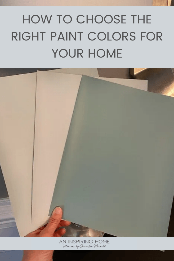
So you understand when we say it is a small element, but a big decision. Now the dilemma that turns here is how to choose the right one when there are so many different options? How to achieve that look I’m aiming for? I got it, it’s a tricky decision. That’s why I decided to walk you through the complete 5-step process to choose the right paint colors for your home.
This blog post contains affiliate links. If you purchase from me, I may earn a small commission at no extra cost to you. Thank you for your support.
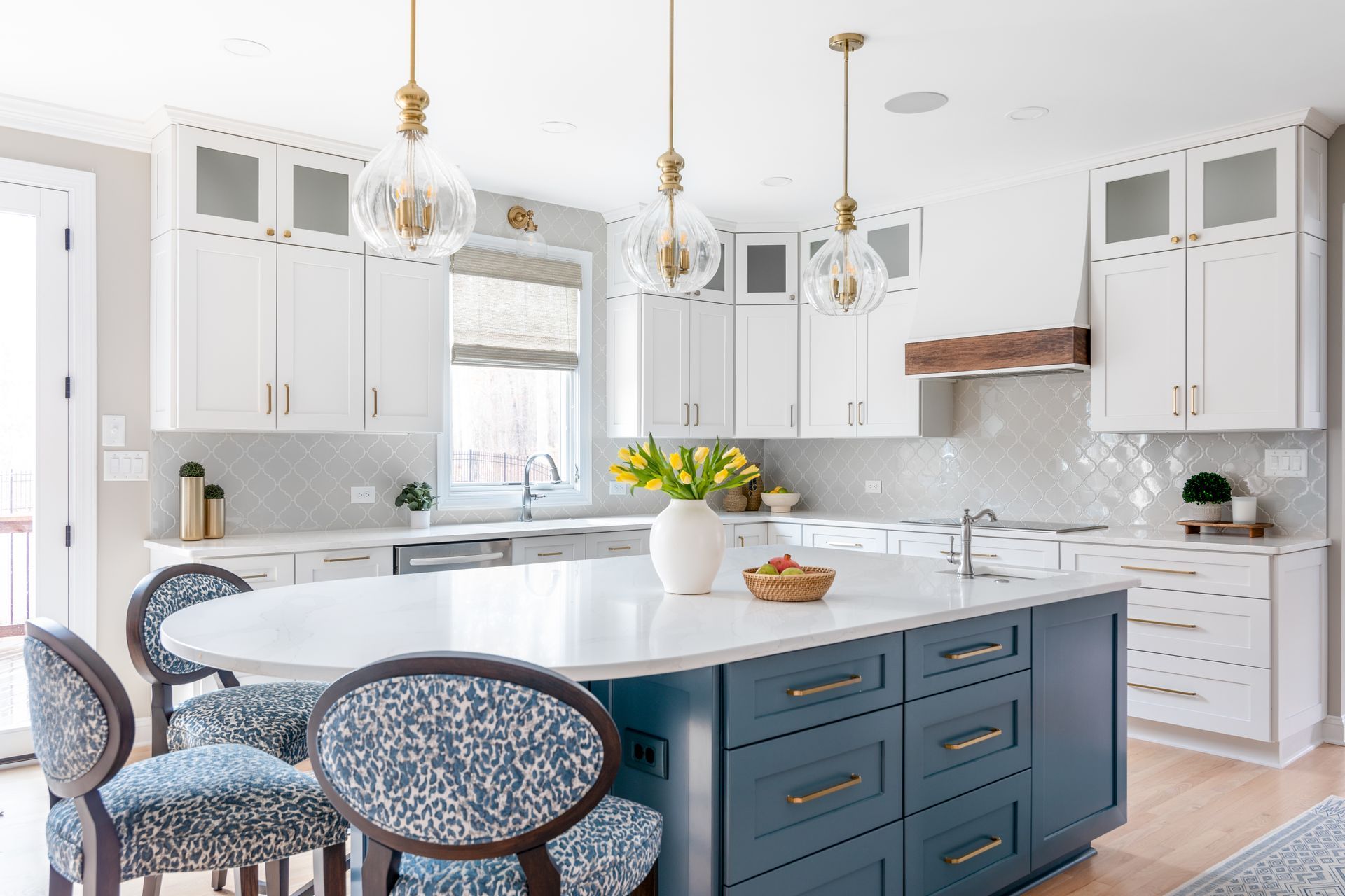
love the look? shop it here!

Step #1. Look at the existing finishes in your room.
Flooring, counters, ceiling, kitchen cabinets, etc. Or, in other words, things we cannot immediately change.
Plan your new color around these elements. Does the color on the paint chip have the same effect on your room? Does it match that element? Make sure to compare them side-by-side to make the best choice. My advice here is to choose 2 to 3 different colors to see which one fits best and creates the effect you want.
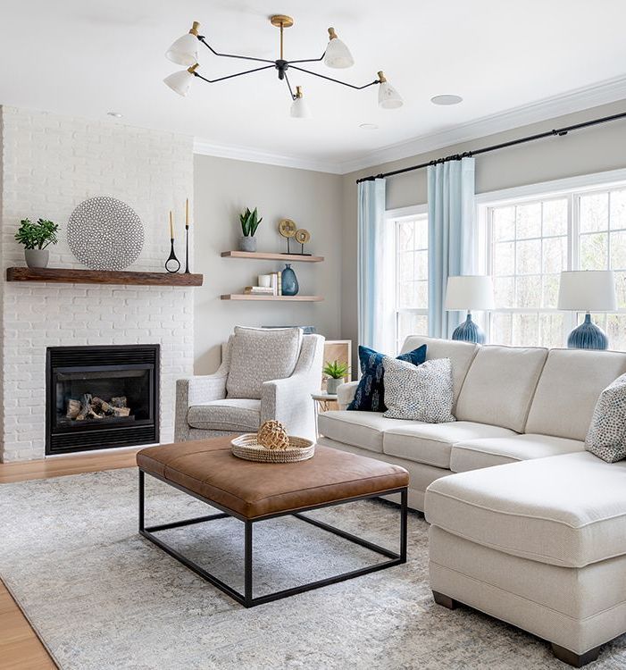
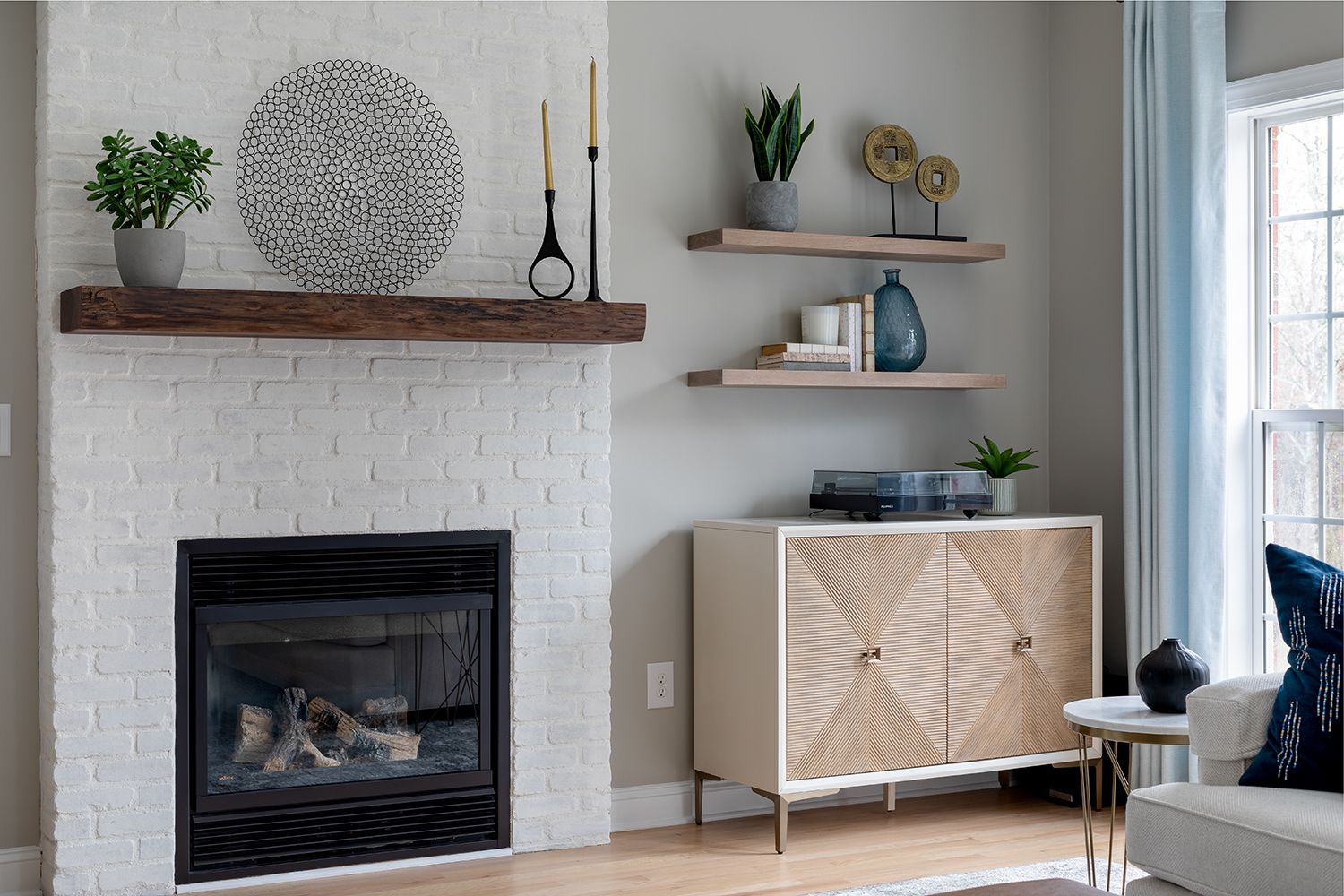
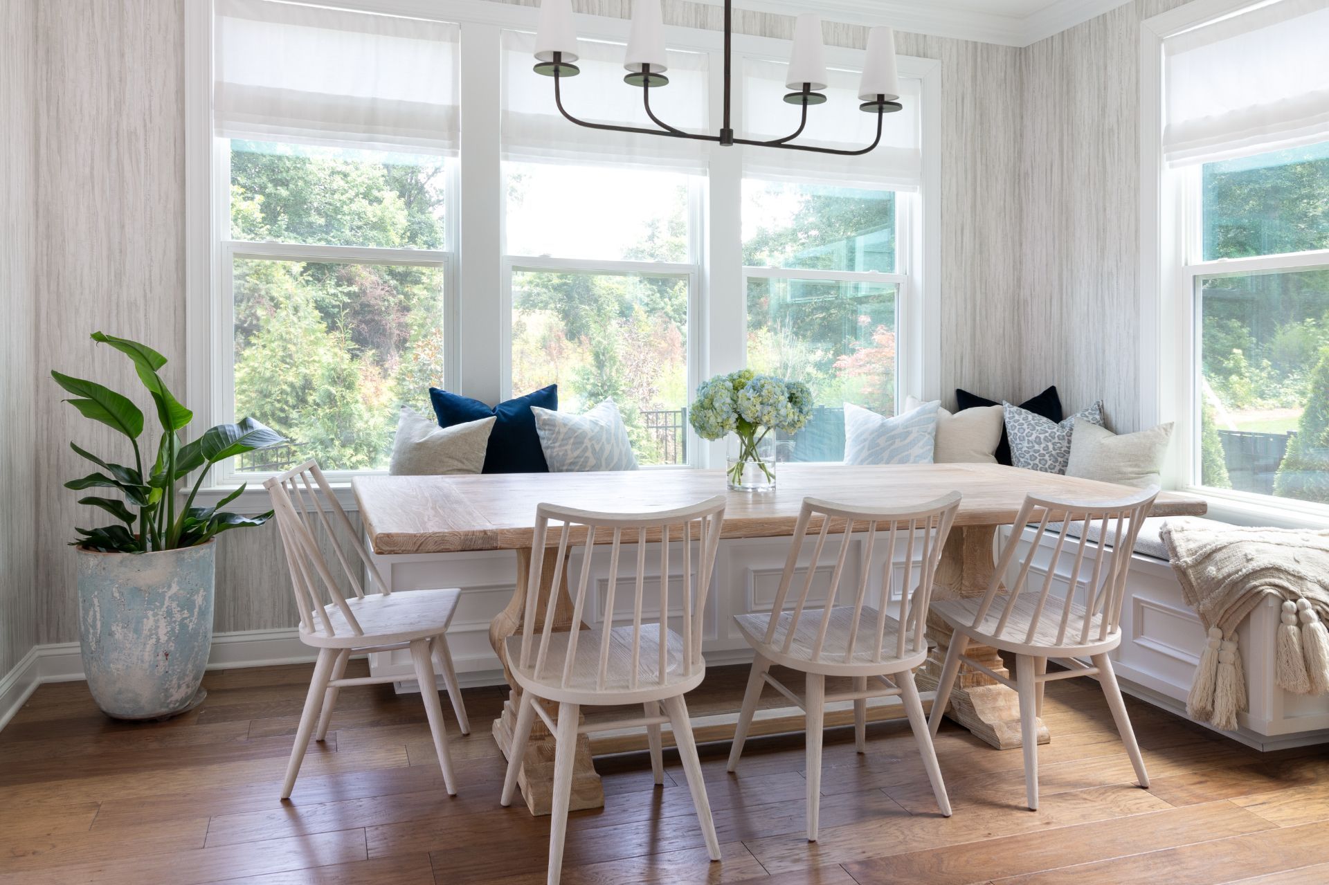
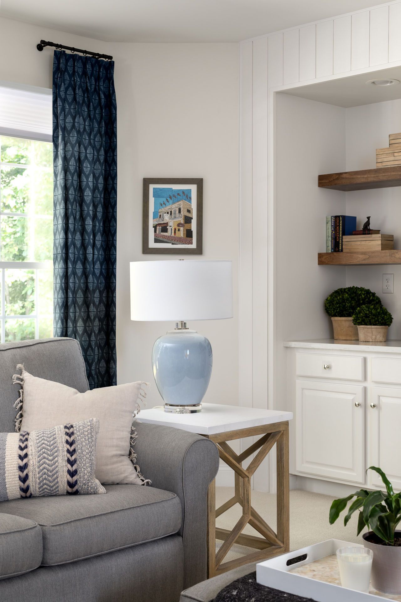
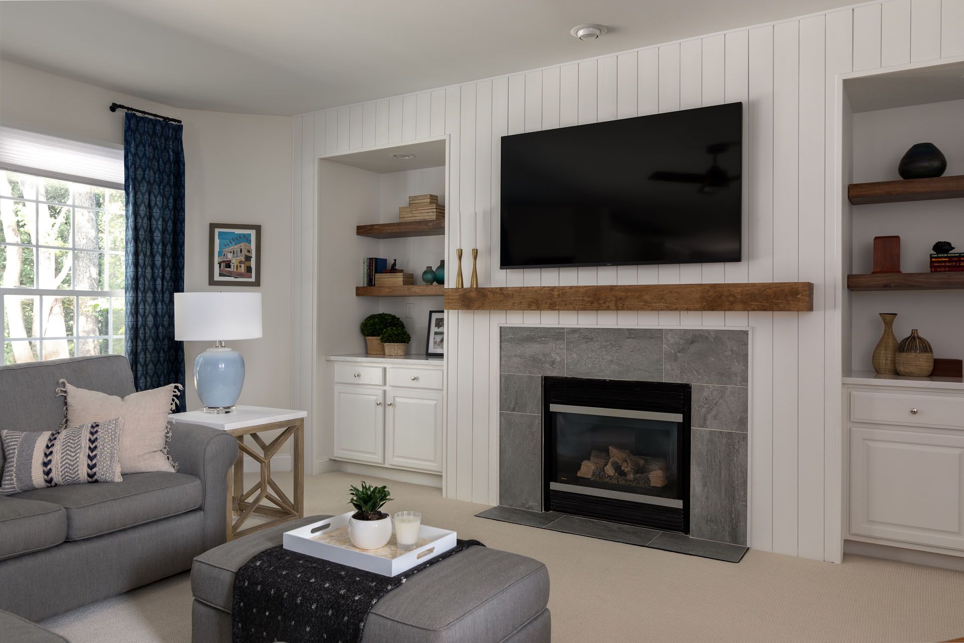
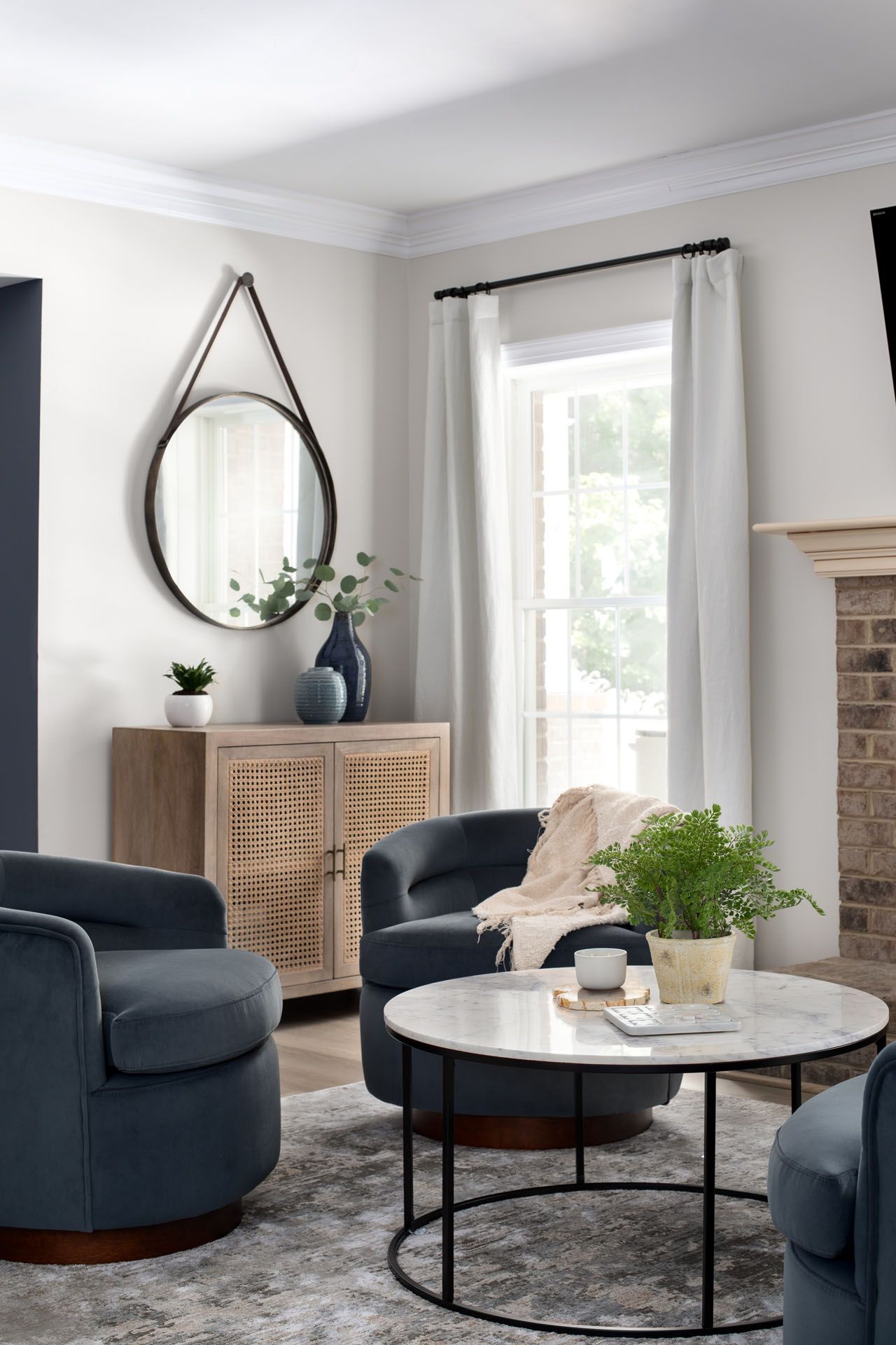
Step #2. Consider a “key element”
Take a look at your room. What is one crucial element you cannot live without? It may be that rug you love or those drapes that complement your space so well. Or that piece of furniture or artwork that expresses who you are. This also plays an important role. My goal as a designer is that you love your home, so I always recommend to my clients to pick their favorite accessory or element and consider this as well when choosing their paint color. We want the space to feel cozy, cohesive, and ideal, so by considering this, you’ll fall even more in love with that transformed room.
recreate your room with these key elements:
step #3. Match the paint color to the feeling you want in the room
If you never heard of the psychology of color, let me give you a quick intro to it. This concept refers to how certain colors can impact our behavior. While warm colors, such as red, orange, and yellow can boost our enthusiasm, and provoke happiness, or excitement; there are cool colors, such as blue, purple, and green that can foster a feeling of safety, calmness, and provide stability and balance. There’s no right or wrong here, it will all depend on your personality and decorating style. Make sure to take this quiz to help you figure this out!
If you’re too afraid of going bold,
my recommendation is to go with green or blue. Blue paint is just like that perfect pair of blue jeans that goes with everything. You can never go wrong here. Plus you can create a natural feel and focus on calmness. If you want to go in this direction, make sure to check out
this previous post from 2022’s Sherwin William color pick.
step #4. test your paint!
Once you’ve narrowed down your decisions, based on the previous steps, please test your paint!
Try different samples, and put them next to the key elements in your room. Also, it’s good to know you don’t need to make the decision right away. Leave the paint samples on for a few days and think about how you feel. Ask other family members, if you share that room, and go with your gut. Select the one that you like the most.
I also want you to consider mass tones and undertones when testing your paint. This is done whenever a color is made by mixing two or more colors together. The mass tone is what you see first, it’s going to tell you what the actual color is. The undertone is the color you don’t see. That’s why sometimes you will notice that the color in the paint chip looks different than your test sample.
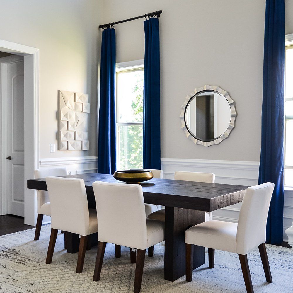
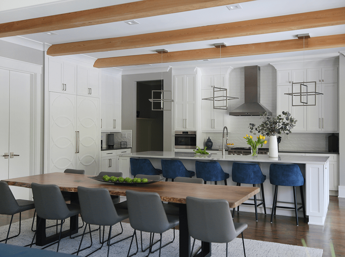
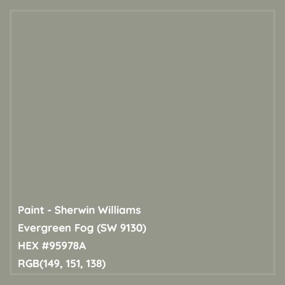
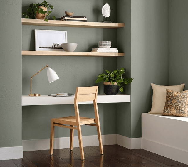
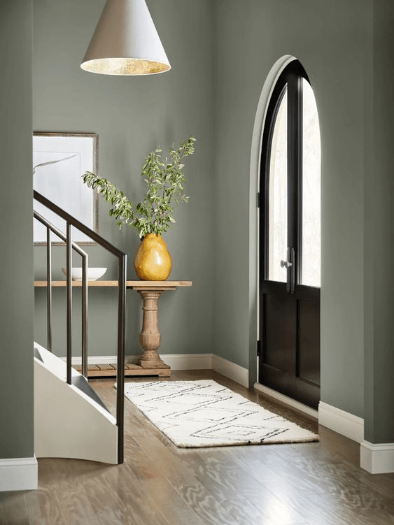
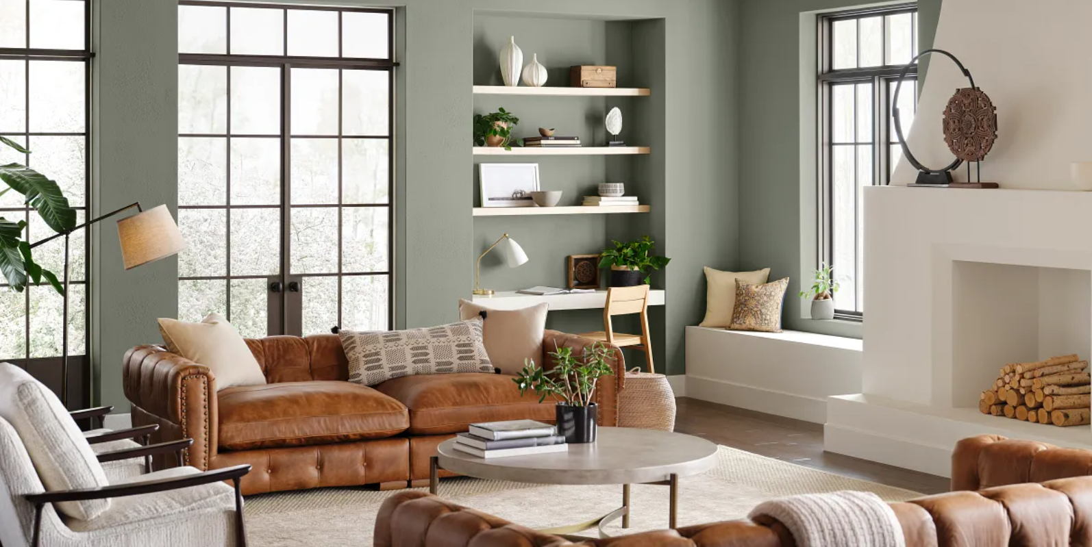
Take a look at this example of Sherwin William’s Evergreen Fog.
Check the actual paint chip vs. paint application in each one of these rooms. Can you spot the mass and undertones? Leave your response in the comments!
Another thing you should consider when testing and choosing your paint is lighting. While natural lighting works best, different bulbs can produce color variations, like blueish, or yellow.
If you get overwhelmed in this process, I’m happy to help.
Through my consultation service, I can highlight the best options for your space.
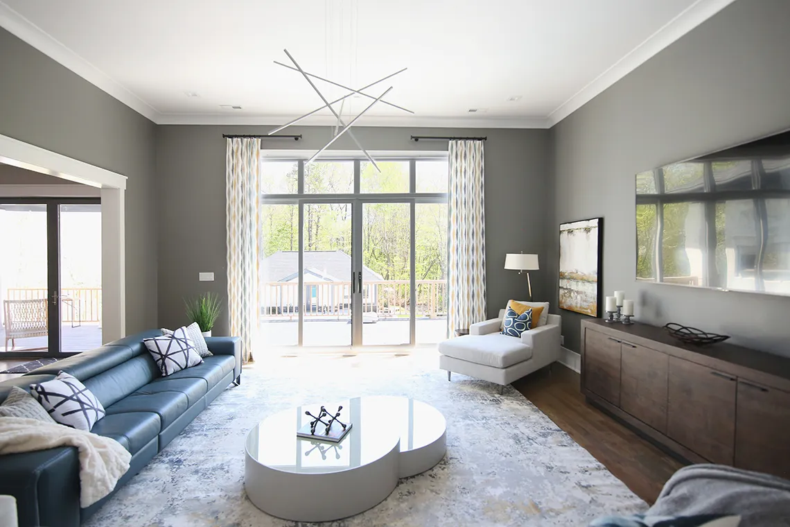
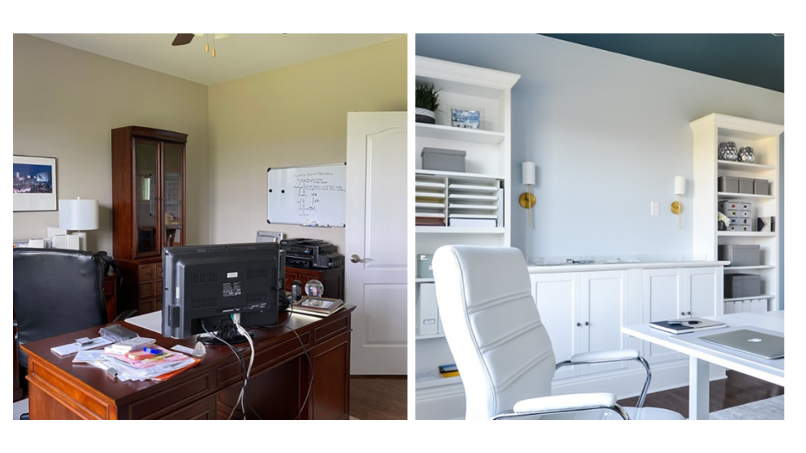
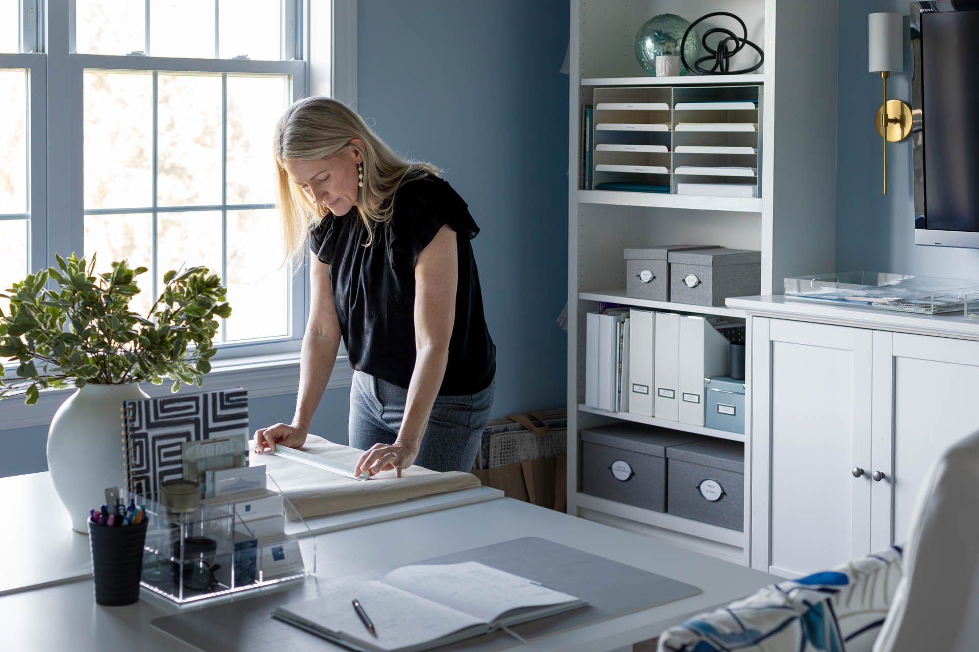
step #5. strike a balance
Last but not least, my advice would be to balance out warm and cool elements in a room or choose a statement color that will help create the effect you want. Take a look at these before and after pictures from my home office. As you may have noticed, my favorite color is blue, so I decided to update the look and include new elements, such as lighting, and modern accessories, and now, I’m more productive than ever. Trust me when I say that paint is a small thing that goes a long way.
By the way, make sure to stay tuned to my future posts, as I’ll be sharing my complete home office renovations.
I hope these 5 steps will help you make the best decision when it comes to painting color. If you’re feeling overwhelmed, don’t hesitate to book a call with me!
Pin this article here!
What’s your design style?
Find out what kind of interior design best suits your inner self. From Transitional to Modern, it's time to make your home a place you’ll love!
You can opt-out at any time. Please note we do not share your information with anyone.

I work with busy families to create beautiful and functional spaces by providing local design services in the Charlotte/Waxhaw area and beyond through online design.

What’s your design style?
Find out what kind of interior design best suits your inner self. From Transitional to Modern, it's time to make your home a place you’ll love!
You can opt-out at any time. Please note we do not share your information with anyone.

Recent Posts
© 2024 AN INSPIRING HOME | ALL RIGHTS RESERVED | WAXHAW, NC