If you’re reading this blog post, it’s probably because you feel something is missing in your space. You know, when you walk into a room of your home, and it feels…meh. Or even worse, that room looks incomplete, overcrowded, or doesn’t meet your wants or needs. But here’s the good news: there’s always room for improvement in interior design.
So, if you’re tired of the buy-and-return game, not happy with the choices you’ve made for your room, or feel like it’s missing something, keep reading because, in this blog post,
I share seven interior design mistakes and how to fix them!
Seven Interior Design Mistakes (and How to Fix Them!)
Let’s start by discussing what an interior design mistake is so we are in the same context.
Usually, it refers to one of the following reasons:
- One or several rooms in your home don’t feel finished. Despite buying endless decorating elements, you walk into a room that either feels empty or lacks personality, and at this point, it’s more than the look you’re uncomfortable with; it’s the feeling of disconnect.
- There’s a lack of cohesiveness throughout your home. Instead of every piece falling into place like a beautiful place, your space feels like a collection of elements that don’t match or fit together.
- You have a nagging feeling that something is off, but you can't quite place your finger on it. As a professional designer, I’ve learned that when your gut tells you something is wrong, you should listen to that feeling. The problem is that most of us don’t know where to start or what to do moving forward.
As I mentioned before, the good news is that you can fix all these mistakes. Every design is an opportunity to create a home that speaks to your own lifestyle and feels good to be in. Honestly, it’s more than the looks; it’s about designing a home you’ll love, or as we commonly refer
to it in the design world, neuroaesthetics.
So, let’s get to work and highlight the seven most common interior design mistakes and how you can avoid them moving forward.
#1. Your Rug Is Too Small
The
number one mistake we see in every project we take is having a small rug.
Your rug is simply too small if it’s “floating” in the center of the room without a sofa or chair anchoring it.
It looks like a postage stamp in the middle of a room and doesn’t provide enough visual interest or create the stage for your furniture to sit on.
The rules of thumb for a seating grouping, which might include a sofa and other upholstered pieces, are:
- All front legs of furniture sit ON the rug, and the back legs sit OFF the carpet, or,
- Both the front and back legs of furniture sit ON the rug
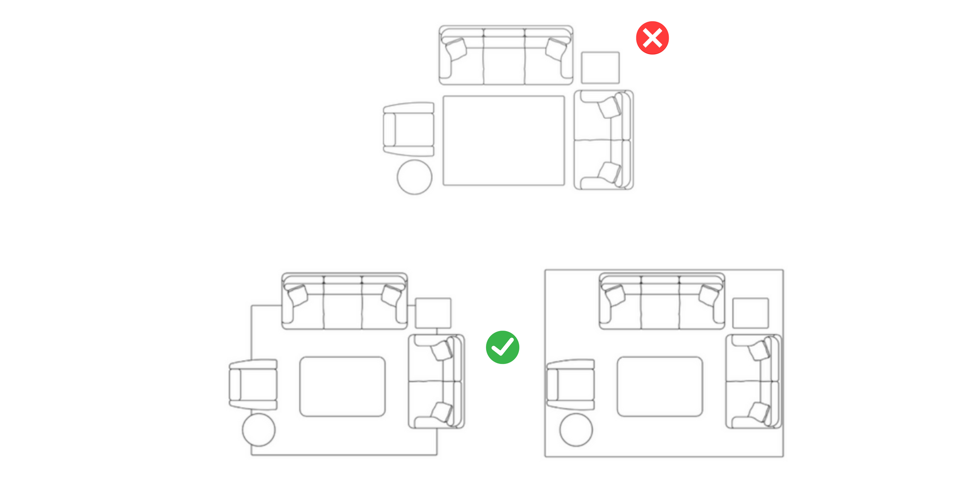
Do you see the difference between these layouts? In the first one, we have a rug that looks like a postage stamp in the middle of a room. It doesn’t command sufficient visual interest nor adequately create the stage for your furniture to sit on.
Our second and third layouts show more cohesiveness and balance between each element.
Here’s a pro tip: If you are shopping for a rug under existing furniture and want to determine the correct size, measure from the center point of the upholstered furniture or the back of your upholstered furniture; that will help you get accurate measurements for an efficient purchase.
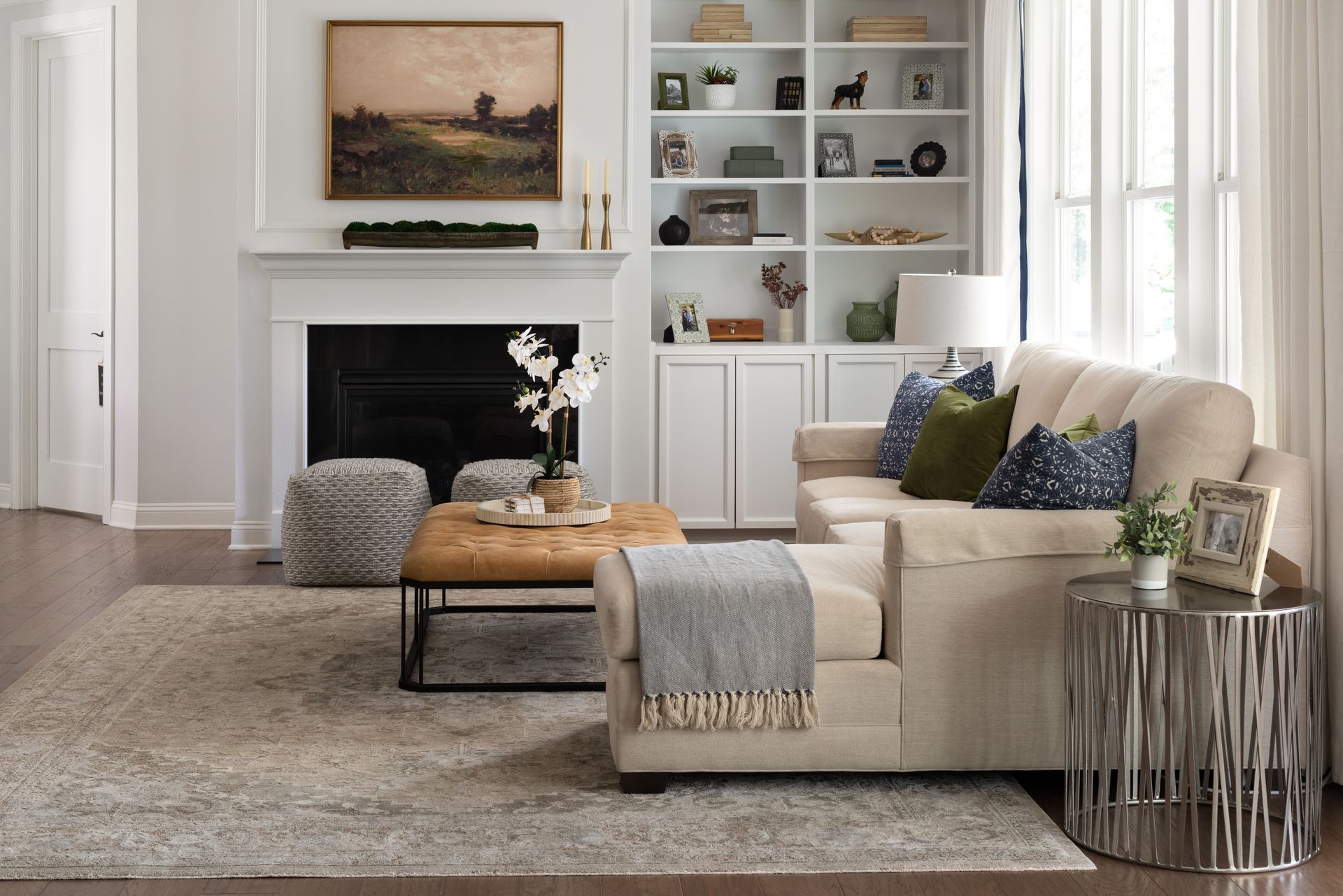
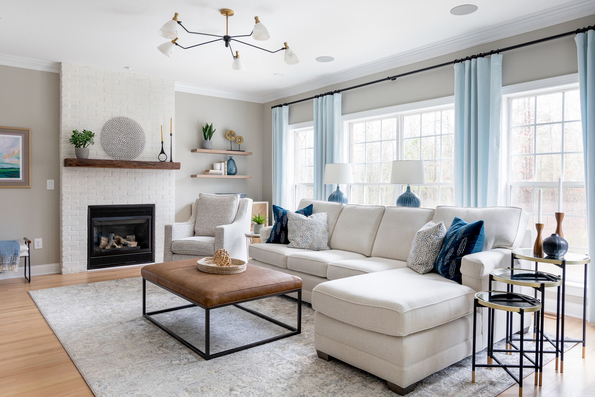
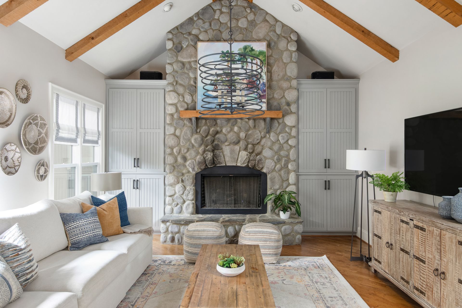
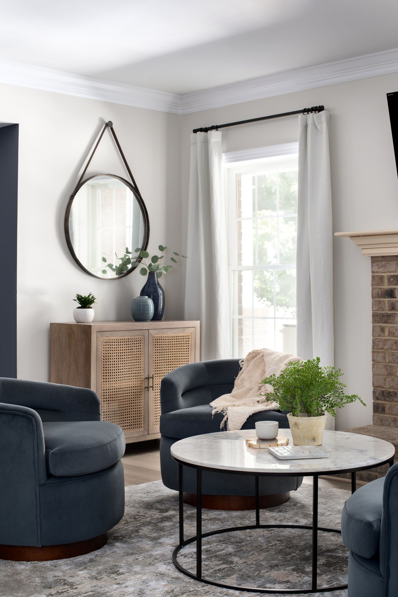
In our Refined Casual Living Project, we completed the room by adding this customized rug, which ties everything together!
Tap here to see the before-and-after transformation!
#2. Your Drapes Are Hung Too Low
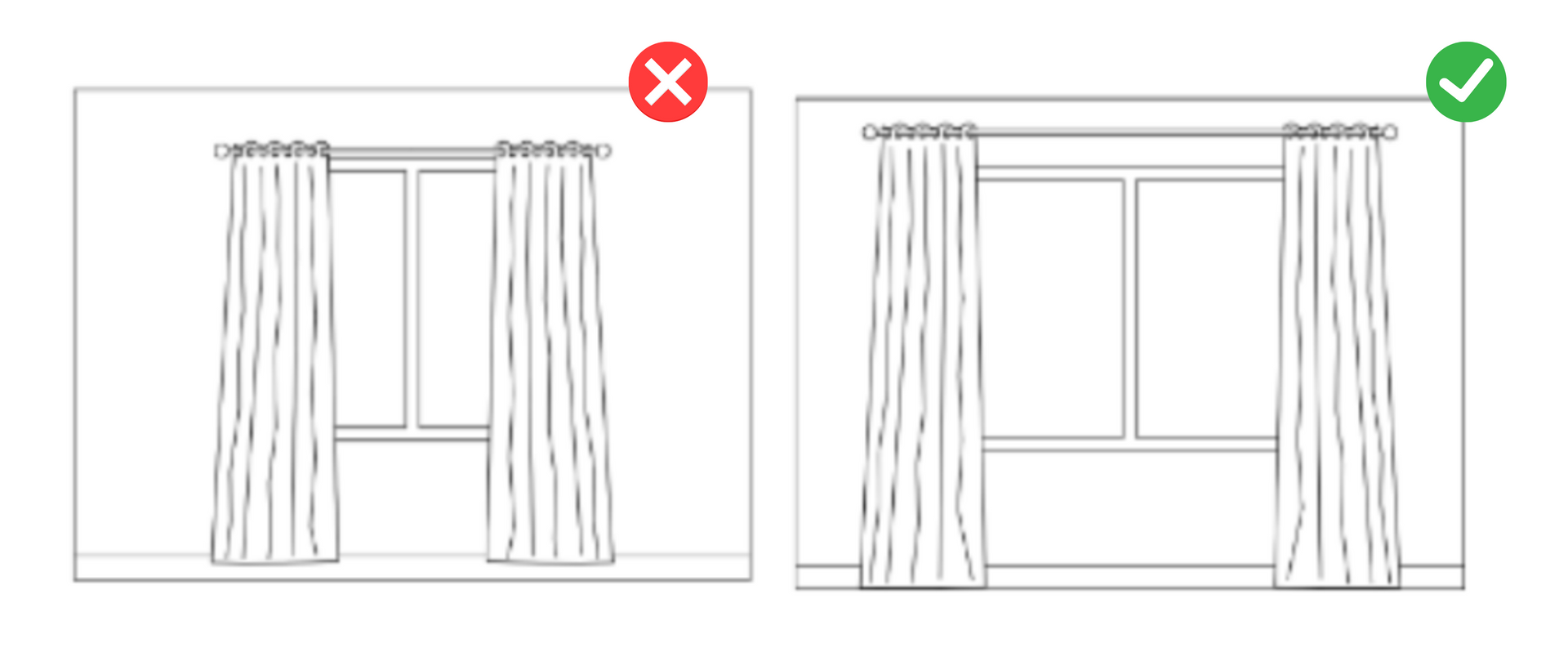
Did you know that hanging your drapes too low will reduce the size of your room?
Avoid this mistake by placing your drapes high and wide to make windows larger and ceilings higher.
Drapery rods should extend a foot beyond the window trim, and you should hang them approximately halfway between the top of the window trim or close to the ceiling.
See how the room expands when we change this element:
Here’s a pro tip: It is often well worth the additional expense to line your draperies, whether ordering or having custom-made. It enhances the fullness and visual depth of the draperies; it also protects drapery fabric from sun and moisture damage, enhances light-blocking and privacy, and creates a unified look when viewed from the exterior of your home.
#3. Your Artwork Is Way Too High
I like to think of artwork as jewelry; it completes your room and even provides a statement between the rest of the elements.
So, if you invest in art pieces for your home, do not hang them too high.
Your art should be in the vertical center of the piece, 58” to 64” above the ground. This measure is at eye height for average adults. An average height woman is 5’4” and an average man is 5’8” tall, and our eyes are 4” to 5” below the tops of our heads.
Take a look at these images. The scale of the artwork on the left is undersized, at only half the width of the sofa, and needs to be correctly hung above eye level.
Contrary to the image on the right, where the proportion is much more pleasing, with an art piece that is two-thirds the width of the sofa.

Artwork can also serve as inspiration for your projects too. In our
Raging Sea Serenity Project, we used the artwork as a starting point for this remodel. As you can see, it’s perfectly aligned with the elements and adds a visual interest to the room.
Here’s your pro tip for drapery: If there is window trim or door trim near your art, be sure to hang the art so the top of the frame is a few inches below the top of the trim.
#4. Your Furniture Scale is Off
Another mistake is that the furniture is not proportionate to the space. Whether it’s too big, too little, or just uneven, certain furniture pieces don’t fit in a room, which makes it seem unfinished.
The rule is simple here: if you have a small room, you need small furniture, and if your rooms are larger, you need deep and higher furniture.
For example:
In the left furniture grouping, the occasional pieces, which we often referred to as coffee tables, end tables, and so on, need to be bigger for the overall furniture arrangement. The scale needs to be corrected. When we include larger pieces, as the image on the right shows, the overall composition is more cohesive, and the look is more elevated.
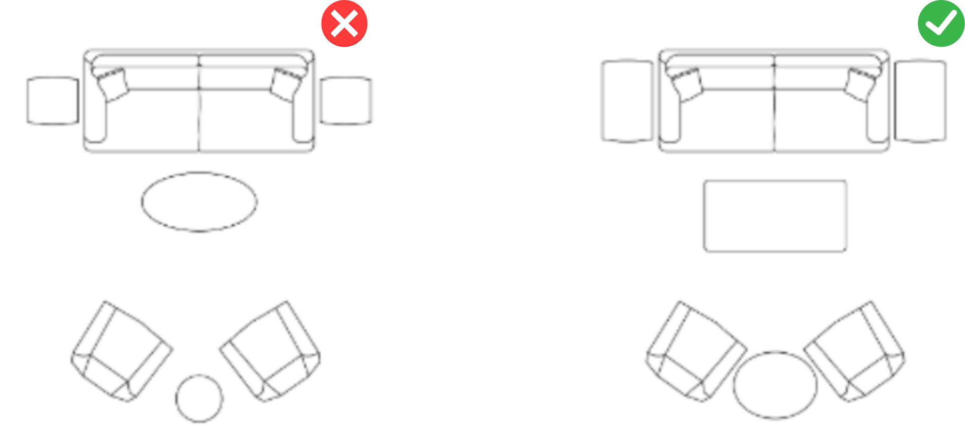
Your pro tip regarding furniture is always to start with a furniture layout, even if that means sketching a to-scale floor plan on graph paper. Only purchase furniture with a scaled plan showing how it will look in your room. What’s even more important is to invest in customized furniture.
In our
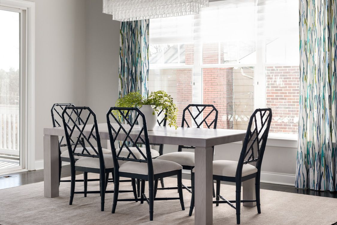
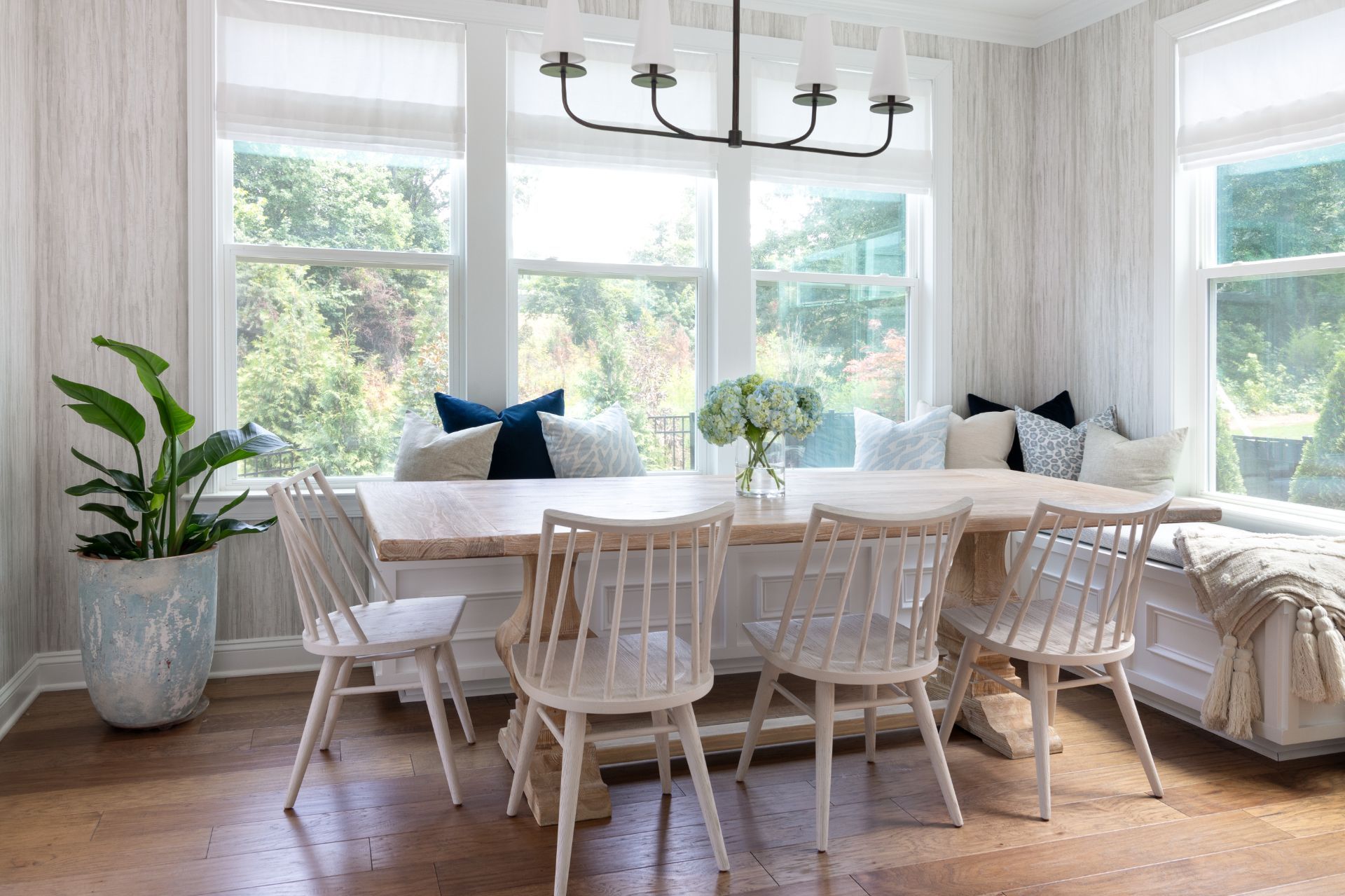
Modern Coastal Abode Project, the dining room furniture was falling apart, so we opted for pieces with performing fabrics and a design that reminded my clients of the coast, where they love spending their vacation time. What’s your favorite thing about this room? Comment below!
#5. Your Room is Missing Layers Of Lighting
Think of a school classroom - overhead fluorescent lighting, with all areas evenly
illuminated. That is NOT the feeling you want in your home.
Residential spaces are far more interesting when they have varying lighting levels throughout pools of light falling on essential furniture pieces and artwork, with less important areas of the space receiving lower light levels.
Adding lighting layers makes your space more exciting and provides a complete look. Follow this rule - Every room should have three levels of lighting:
- Overhead lighting: recessed can lights, flush or semi-flush ceiling fixtures, chandeliers, and pendants.
- Accent lighting: art lights, wall sconces, uplighting, track lighting, or directional recessed.
- Task lighting: floor lamps and table lamps near where you read and under-cabinet lighting in your kitchen.
Notice the layers of lighting in the following photos in some favorite projects.
If, at this point, you feel like something is missing from your home and you need expert guidance to transform it into a place you’ll love, inquire about our services today.
#6. There Are Too Many Little Things
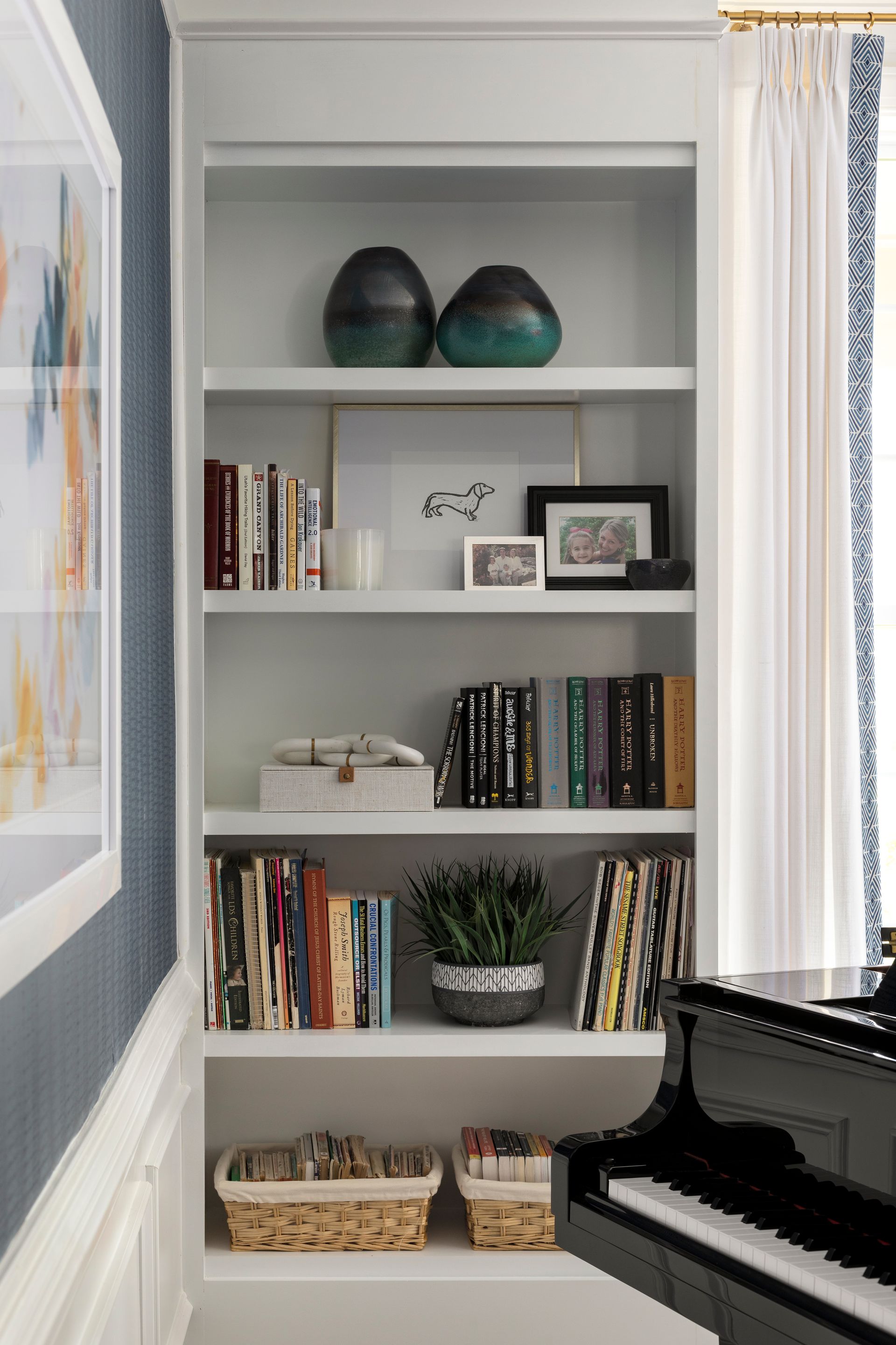
Small-scale, delicate decorative elements clustered together in your space make your eye travel from thing to thing with no one place to focus. This mistake gives the impression that the room is incomplete and ungrounded, with no focal point. It also makes a room feel cluttered.
As far as decorative pieces go,
larger-scale items feel more intentional, making a statement, commanding attention, and looking sophisticated.
So, when it comes to adding decorative objects to dress up a room, go bigger, go fewer, go with odd numbers, and group together.
Look through your rooms and see if you have many small things: Is your space over-accessorized? Reduce. Pair up. Or remove. You will see an instant positive result.
Here’s a pro tip: Contrast is essential when choosing decorative objects. Select light or brightly-colored items to go on a dark bookcase or table, and select dark-toned items to sit on lighter furniture.
#7. Your Furniture Doesn’t Have a Breathing Space
What do I mean by breathing space? If it’s jammed together or pushed through the wall.
For example, we have packed or jammed furnishings or backed up pieces against the wall in these two layouts. Neither of these rooms allows for social conversation or has an intention or purpose in mind.
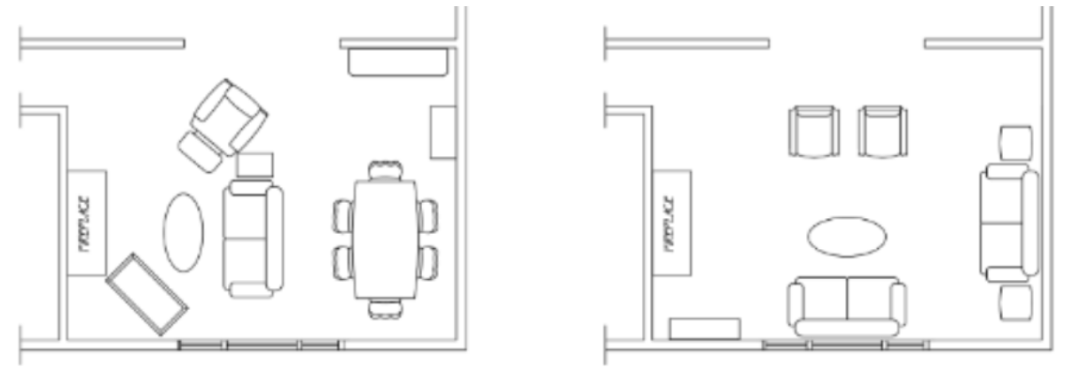
Here are three things we can do to solve these layouts:
- Center the key room elements with one another along an imaginary center axis line. The layout on the left would be better if the sofa were centered in front of the fireplace.
- Float the largest furniture pieces; bring sofas and other furniture away from the wall and into the center of the space. An entire furniture grouping can sit away from all perimeter walls, providing ample space to walk around.
- Allow breathing room within all your furniture arrangements. Pull pieces several inches away from walls except for bookcases and case goods. Furniture adjacent pieces, such as a sofa and end table, should not touch — having 2” to 6” spacing between them is ideal.
Let’s see how it looks our layout once we fix these mistakes:
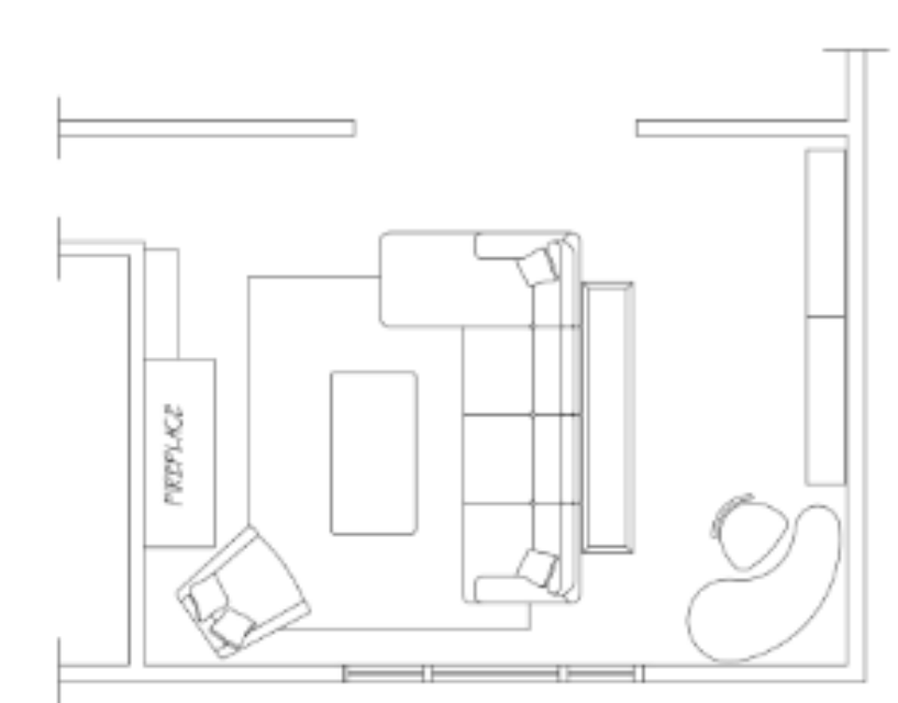
We achieved more sophistication in this layout by arranging the furniture thoughtfully for a complete balance.
Play with the placement of furniture pieces.
- How does pulling a piece out just a bit from the wall look?
- What happens when you move the coffee table closer to the sofa?
- What happens when you give the dining chairs some space? Yes, that might mean you must put a chair or two in a separate room until needed.
In our Cozy Family Sanctuary Project
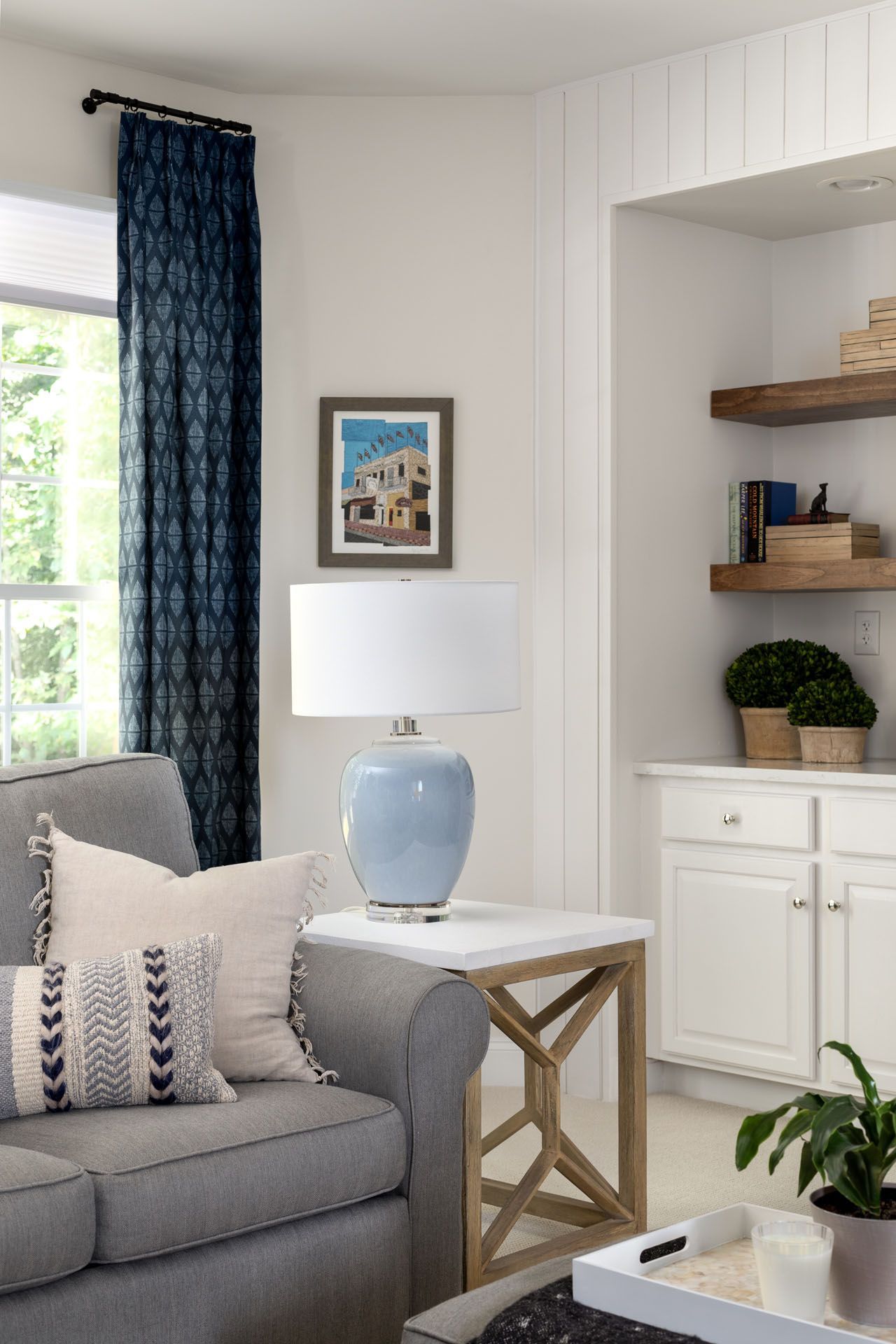
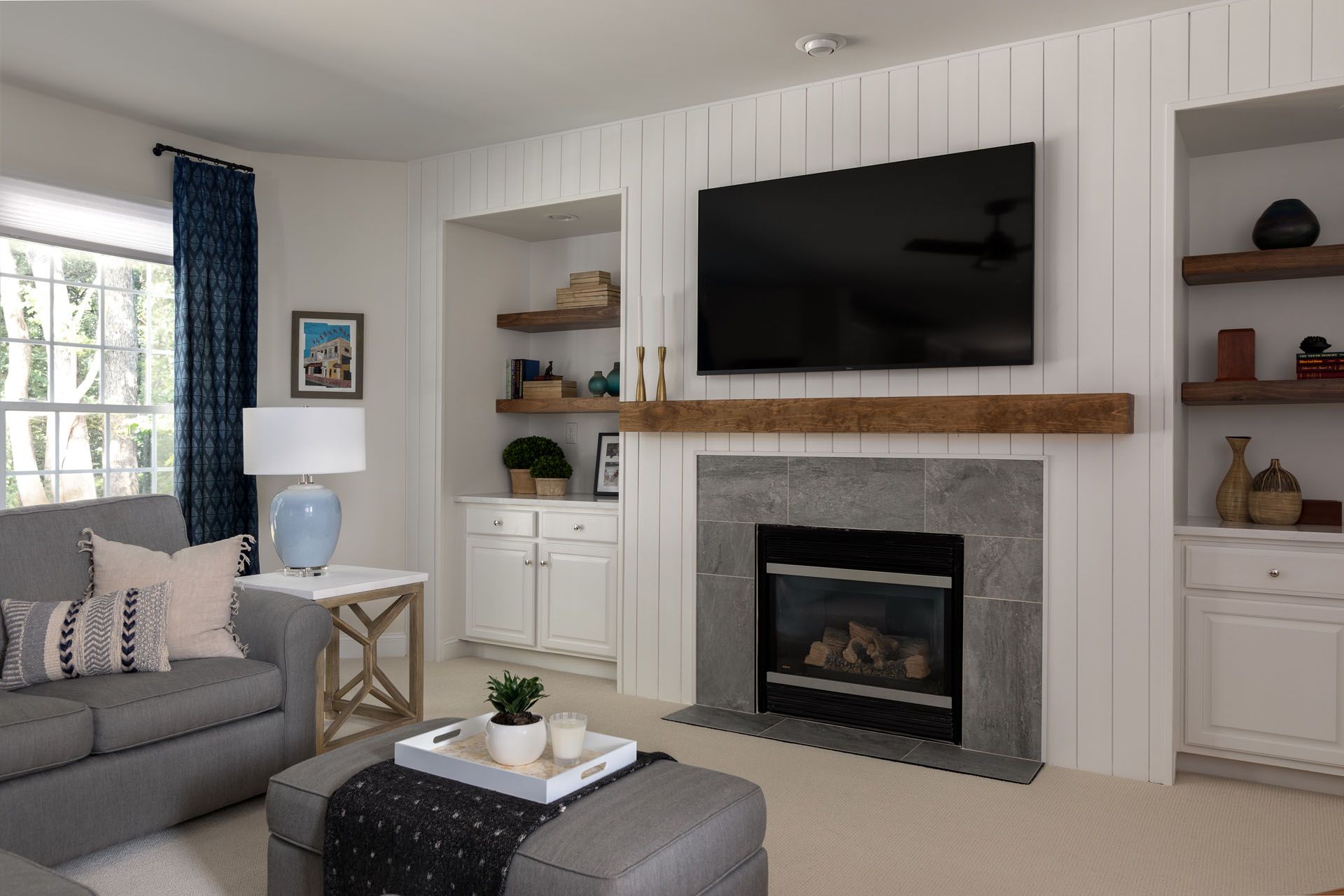
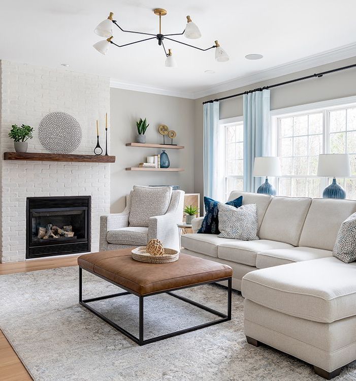
(which has been featured in Houzz twice!), we added furnishings that, even though different, complement each other. Notice the coziness, the layers of lighting, the fewer yet bigger accessories, and the appropriate sized rug.
My favorite part about highlighting these mistakes is that there are opportunities to improve things and turn your home into a place you’ll call your own. If you need expert guidance and expertise to help you make the most of your space, inquire about our services today!
Remember to pin this article and share it with your family as inspiration for your next remodeling project.
What’s your design style?
Find out what kind of interior design best suits your inner self. From Transitional to Modern, it's time to make your home a place you’ll love!
You can opt-out at any time. Please note we do not share your information with anyone.
I work with busy families to create beautiful and functional spaces by providing local design services in the Charlotte/Waxhaw area and beyond through online design.
What’s your design style?
Find out what kind of interior design best suits your inner self. From Transitional to Modern, it's time to make your home a place you’ll love!
You can opt-out at any time. Please note we do not share your information with anyone.
Recent Posts
© 2024 AN INSPIRING HOME | ALL RIGHTS RESERVED | WAXHAW, NC

